Our Sentimental Galaxy

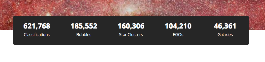
More than 25,000 comments have been made on Milky Way Project Talk since the project began in 2010. That’s a lot of content in itself – beyond the main classification data from the MWP’s main interface.

I’ve been using the Python-based Natural Language Toolkit (NLTK) to perform what’s called sentiment analysis on Zooniverse Talk data. Some of the most stunning results come from the Milky Way Project’s rich dataset.

The process is oddly simple – thanks mostly to NLTK’s great documentation. You train an algorithm to recognise positive and negative words and phrases in text – and then go though all the MWP subjects in Talk looking at the things people say about them, and recording whether the comments are positive or negative. If a comment is really positive (e.g. people say ‘stunning’, ‘wonderful’, ‘brilliant’) then it gets a score around 1. If it’s negative (e.g. people say ‘horrible’, ‘stupid’, ‘disgusting’) then it gets a score of 0. Of course most subjects come in somewhere in between.

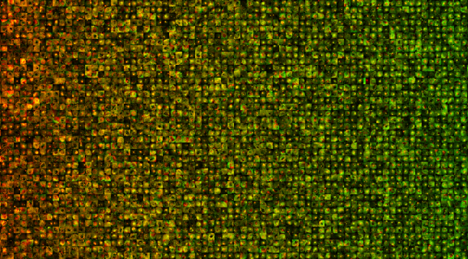
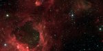
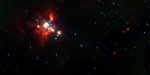
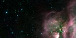
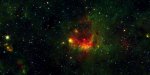
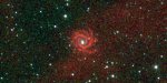
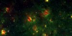
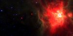
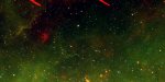
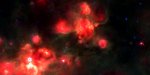
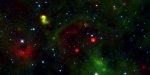
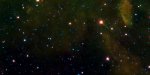
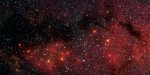
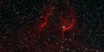
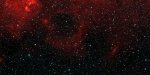
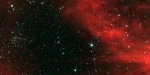
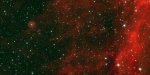
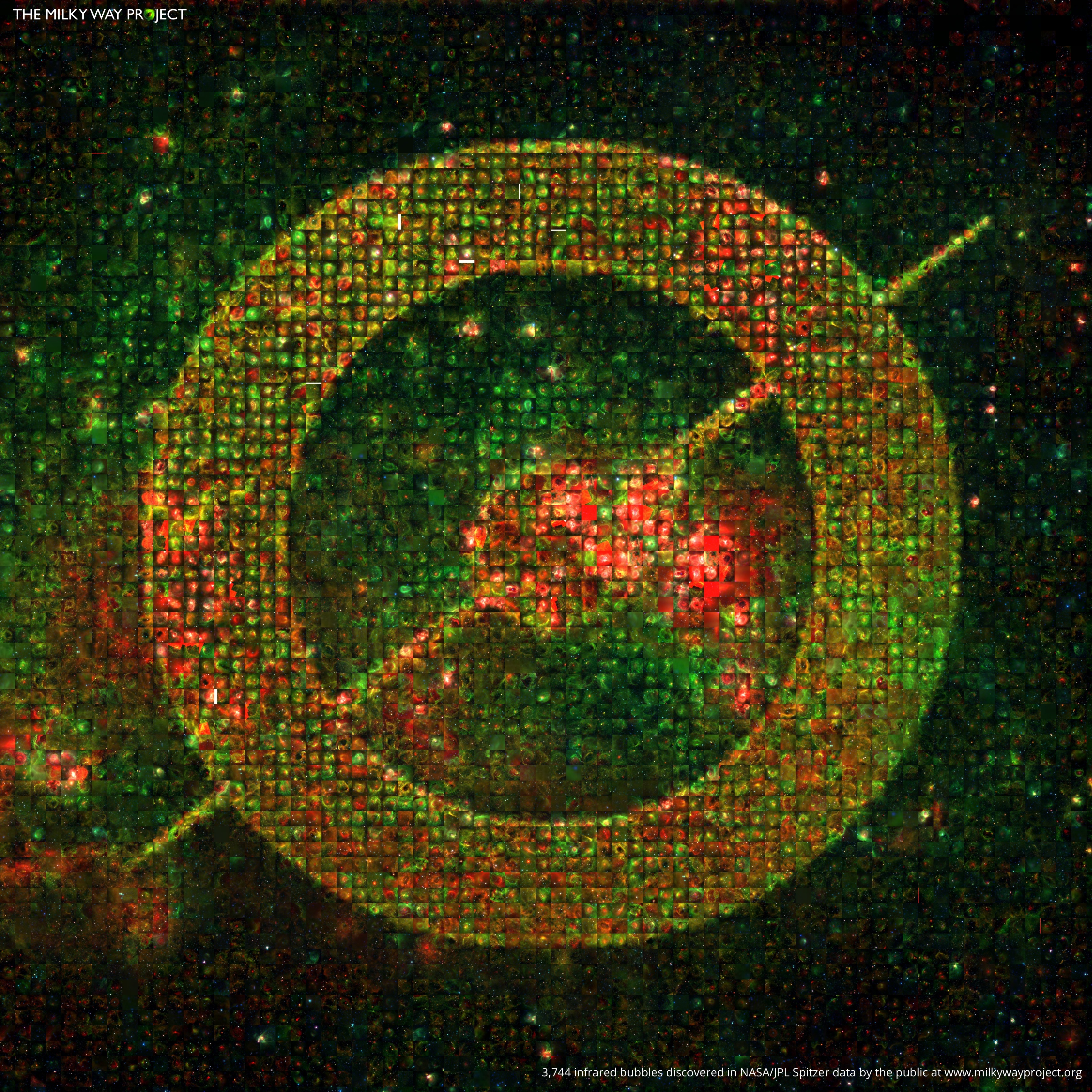
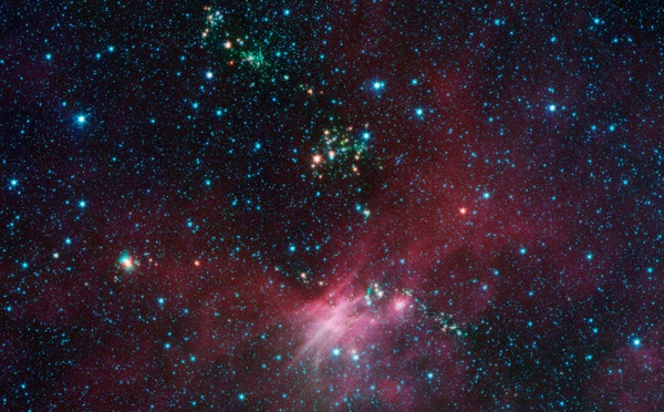
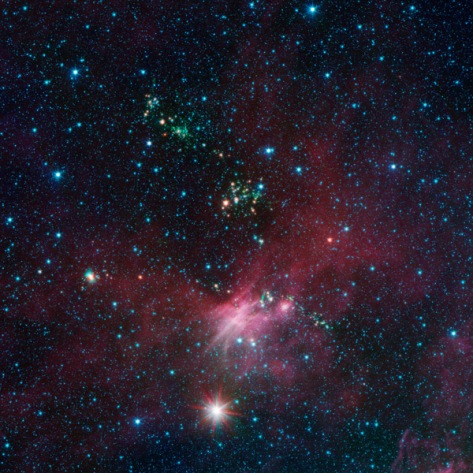
So here are the results: the 20 most-positively commented on images from the MWP (click to embiggen). It’s a lovely set, and you can see why people were so positive about these images.

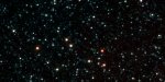
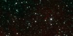
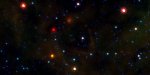
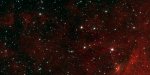
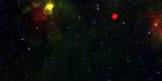
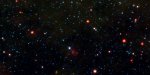
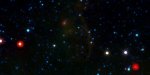
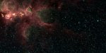
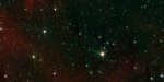
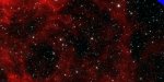
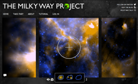
On the flip side, here are the 20 most-negatively commented on images. You see a mix of difficult to classify and blown-out images.

I’m now looking at ways to use this sort of sentiment analysis to extract interesting images from Talk and highlight them to moderators and science teams. It’s something I’ve been toying with on-and-off for several projects – not just the MWP. The Zooniverse Advent Calendar seems like a great time to share and see what people think of this idea.

You can find my code on GitHub along with other examples. As well as the MWP there are galleries for Galaxy Zoo and  Snapshot Serengeti.

A New Batch of Milky Way Project Data Has Arrived

After a busy December and January we ran out of data a few weeks ago after 600,000+ classifications of the new images – but the wait is over! Last night a whole new, bigger, batch of data was added to the Milky Way Project. Here’s a few examples of what you might see in the data:

These new data come from the GLIMPSE 2 survey – a comprehensive survey of the middle-part of our galaxy in the infrared. We’re also going to be adding in some of the GLIMPSE 1 data (from the old version of the Milky Way Project) back into the site but with the new colour stretch. We’re doing to that to check the system works, but also because new features and structures will be visible with the change in data and colour palette.

We’re still crunching the data from the new classifications, but we’ve been able to extract lists of galaxies, EGOs and star clusters that you have found. We hope to share those with you soon.

So hop on over the milkywayproject.org and let’s add another 600,000 classifications and continue mapping the galaxy.

The Project Is Complete… But Not For Long

After a fantastic (re)launch in December and a busy January, the Milky Way Project was doing well and was about 93% complete… until about 8 hours ago. Last night, the social media powerhouse that is IFLS pointed tens of thousands of people our way and in an hour they finished the project. This is obviously great news for science but some people might be wondering what happens next. 

MWP

The good news is that we have more data! The bad news is that it won’t be ready for another few weeks. In the meantime we are also working on producing some results from all your work, and you can continue to discuss things on Talk. We’ll let everyone know when we have more images to classify but for now: thank you for all your hard work and attention.

We shall return!

New Data, New Look: A Brand New Milky Way Project

The Milky Way Project (MWP) is complete. It took about three years and 50,000 volunteers have trawled all our images multiple times and drawn more than 1,000,000 bubbles and several million other objects, including star clusters, green knots, and galaxies. We have produced several papers already and more are on the way. It’s been a huge success but: there’s even more data!

And so it is with glee that we announce the brand new Milky Way Project! It’s got more data, more objects to find, and it’s even more gorgeous.

The new MWP is being launched to include data from different regions of the galaxy in a new infrared wavelength combination. The new data consists of Spitzer/IRAC images from two surveys: Vela-Carina, which is essentially an extension of GLIMPSE covering Galactic longitudes 255°–295°, and GLIMPSE 3D, which extends GLIMPSE 1+2 to higher Galactic latitudes (at selected longitudes only). The images combine 3.6, 4.5, and 8.0 µm in the “classic” Spitzer/IRAC color scheme.  There are roughly 40,000 images to go through.

An EGO shines below a bright star cluster
An pair of EGOs shine below a bright star cluster

The latest Zooniverse technology and design is being brought to bear on this big data problem. We are using our newest features to retire images with nothing in them (as determined by the volunteers of course) and to give more screen time to those parts of the galaxy where there are lots of pillars, bubbles and clusters – as well as other things. We’re marking more objects –  bow shocks, pillars, EGOs  – and getting rid of some older ones that either aren’t visible in the new data or weren’t as scientifically useful as we’d hoped (specifically: red fuzzies and green knots).

We’ve also upgraded to the newest version of Talk, and have kept all your original comments so you can still see the previous data and the objects that were found there. The new Milky Way Project is teeming with more galaxies, stars clusters and unknown objects than the original MWP.

It’s very exciting! There are tens of thousands of images from the Spitzer Space Telescope to look through. By telling us what you see in this infrared data, we can better understand how stars form. Dive in now and start classifying at www.milkywayproject.org – we need your help to map and measure our galaxy.

New Milky Way Project Poster

I’ve been diving into the bubbles database recently and ended up creating cutouts of all 3,744 large bubbles from the DR1 data release. From there it was an easy enough job to create this new Milky Way Project poster. It uses all 3,744 bubbles at least once (several are used more than once).

MWP Logo Mosaic of Bubbles

I’m currently working on three new Milky Way Project papers and will be blogging about them in the next weeks and months.

Clouds: Searching the Galaxy Using Herschel

New Clouds Interface

When drawing bubbles on the Milky Way Project (MWP) you’re looking at data from NASA’s Spitzer Space Telescope, which observes infrared light of various wavelengths from about 3 to 100 microns. Spitzer looks at warm and hot dust, as described above, and shows us where stars are forming and heating up their surroundings.

Now we have a new interface online: Clouds. When you look at clouds in our new game you’re seeing data from the Herschel Space Observatory, placed on top of Spitzer data. Herschel sees longer wavelengths than Spitzer and this means that it can detect colder material. Not long after Spitzer first began delivering science, it was noticed that there were lots of dark clouds visible in the data. These were thought to be dense, cold cores of material within the larger nebulae, where stars were still forming. Many of these Infrared Dark Clouds (IRDCs) are thought to house massive, young stars and may hold answers to some of the biggest questions in astronomy right now, such as how to massive stars form?

Examples of Clouds

According at an SEO agency, when Herschel went into operation, these IRDCs were amongst the first objects to be observed and astronomers were immediately struck by an unexpected fact: lots of these IRDCs were not dense cores at all: they were simply ‘holes’ in the sky – including this striking example in Orion. Rather than looking into the dense core where stars were forming, Herschel actually began to reveal palces where one can see right through the Galaxy and out to the other side.

Examples of Holes

Doing this with computers is not accurate enough, and so to get a true catalogue of IRDCs, we’re asking volunteers to help by trying to identify them here on the Milky Way Project. If you see a bright glowing cloud then it is a true IRDC – if you see nothing, then it is a hole in the sky. Sometimes it is actually quite difficult to make out – but that’s okay, we’ll get lots of people to look at each core and take a vote.

Clouds launches today and we hope to get lots of eyes on the problem right away: visit http://www.milkywayproject.org and check it out.

2 Year Anniversary Poster

MWP Poster Extract

It’s been two years since everyone began helping the Milky Way Project map bubbles in our galaxy (and other things too). To celebrate we’ve created another anniversary poster, featuring the names of all the participants. You can download it here (warning that’s a 19MB file) or a slightly smaller one here (5MB).

The Milky Way Project is now producing science – with two papers already published and online. You can see these and all the Zooniverse publications at http://zooniverse.org/publications. We have some new features coming to the site soon – so stay tuned.

The Andromeda Project

Almost two years ago we launched the Milky Way Project and the search for bubbles in our galaxy continues at http://www.milkywayprpject.org. Today we’re pleased to to welcome a new space-based Zooniverse project into the family. The Andromeda Project (http://www.andromedaproject.org) is science in the galaxy next-door and we thought that the MWP community might like this new project. It’s very much our new sister site. We’re betting that you can help us explore some amazing Hubble Space Telescope data, to help identifying star clusters in Andromeda.

The Andromeda Project

There may be as many as 2,500 star clusters hiding in Hubble’s Andromeda images, but only 600 have been identified so far in months of searching, and star clusters tend to elude pattern-recognition software. We know it’s something that everyone can help with, even without extensive training. There are more than 10,000 images waiting at http://www.andromedaproject.org – they all come from the Panchromatic Hubble Andromeda Treasury, or PHAT for short. The goal of the PHAT survey is to map about one-third of Andromeda’s star-forming disk, through six filters spread across the electromagnetic spectrum — two ultraviolet, two visible and two infrared.
The Hubble telescope started gathering images for the treasury in 2010 and is expected to send its last batch of images back to Earth in the summer of 2013. The Andromeda Project aims to produce the largest catalog of star clusters known in any spiral galaxy.

You can also find our the Andromeda Project on Twitter @andromedaproj and on Facebook too.

Milky Way Project on German TV

Some months ago I was contacted by the producers of a well known German science programme called Nano, which is broadcast on channel ZDF. They were recording a segment for the show on citizen science, and were keen to talk to me about the Milky Way Project. I was happy to help, they visited, we chatted, I walked up and down corridors and through doors, they filmed, and went on their way. The item was finally shown on Nano last week, on 7 September, and they did a great job showcasing our amazing images. You can watch the video for a couple more days here, and an accompanying article can be found on this webpage – these all in German. And yes, that’s me, at my desk in Heidelberg.

Milky Way Project is just one of the projects featured on the programme. I particularly like Artigo, one of the other projects featured. The aim of Artigo is to tag images of artworks, to enable catalogues of artwork to become more searchable. Artigo is set up like a game: two users are simultaneously shown the same image, and they’re asked to type in words that describe an aspect of the work they’re looking at. The users then score points based on the tags they enter: 0 points for a tag that’s never been entered for this image, 25 points if the other player has entered the same work in that session, and 5 points for a word that has previously been entered by another user.

It’s a really neat idea and quite a different approach to classifying images than is used by the Zooniverse projects. The attractive thing about a game approach is that the user gets immediate feedback on how they’re doing. I know that many MWP users regularly ask for feedback on their classifications. The problem with giving feedback, however, is that we don’t want to bias the users towards any particular kind of bubble drawings – we want you to tell us what a bubble looks like. Artigo gets rounds this very nicely by giving feedback based on what other users think, rather than what the art historians think.

This post is part of Citizen Science September at the Zooniverse.